hanning(M)
The Hanning window is a taper formed by using a weighted cosine.
The Hanning window is defined as
$$w(n) = 0.5 - 0.5cos\left(\frac{2\pi{n}}{M-1}\right)\qquad 0 \leq n \leq M-1$$The Hanning was named for Julius von Hann, an Austrian meteorologist. It is also known as the Cosine Bell. Some authors prefer that it be called a Hann window, to help avoid confusion with the very similar Hamming window.
Most references to the Hanning window come from the signal processing literature, where it is used as one of many windowing functions for smoothing values. It is also known as an apodization (which means "removing the foot", i.e. smoothing discontinuities at the beginning and end of the sampled signal) or tapering function.
Number of points in the output window. If zero or less, an empty array is returned.
The window, with the maximum value normalized to one (the value one appears only if M is odd).
Return the Hanning window.
>>> np.hanning(12)
array([0.        , 0.07937323, 0.29229249, 0.57115742, 0.82743037,
       0.97974649, 0.97974649, 0.82743037, 0.57115742, 0.29229249,
       0.07937323, 0.        ])
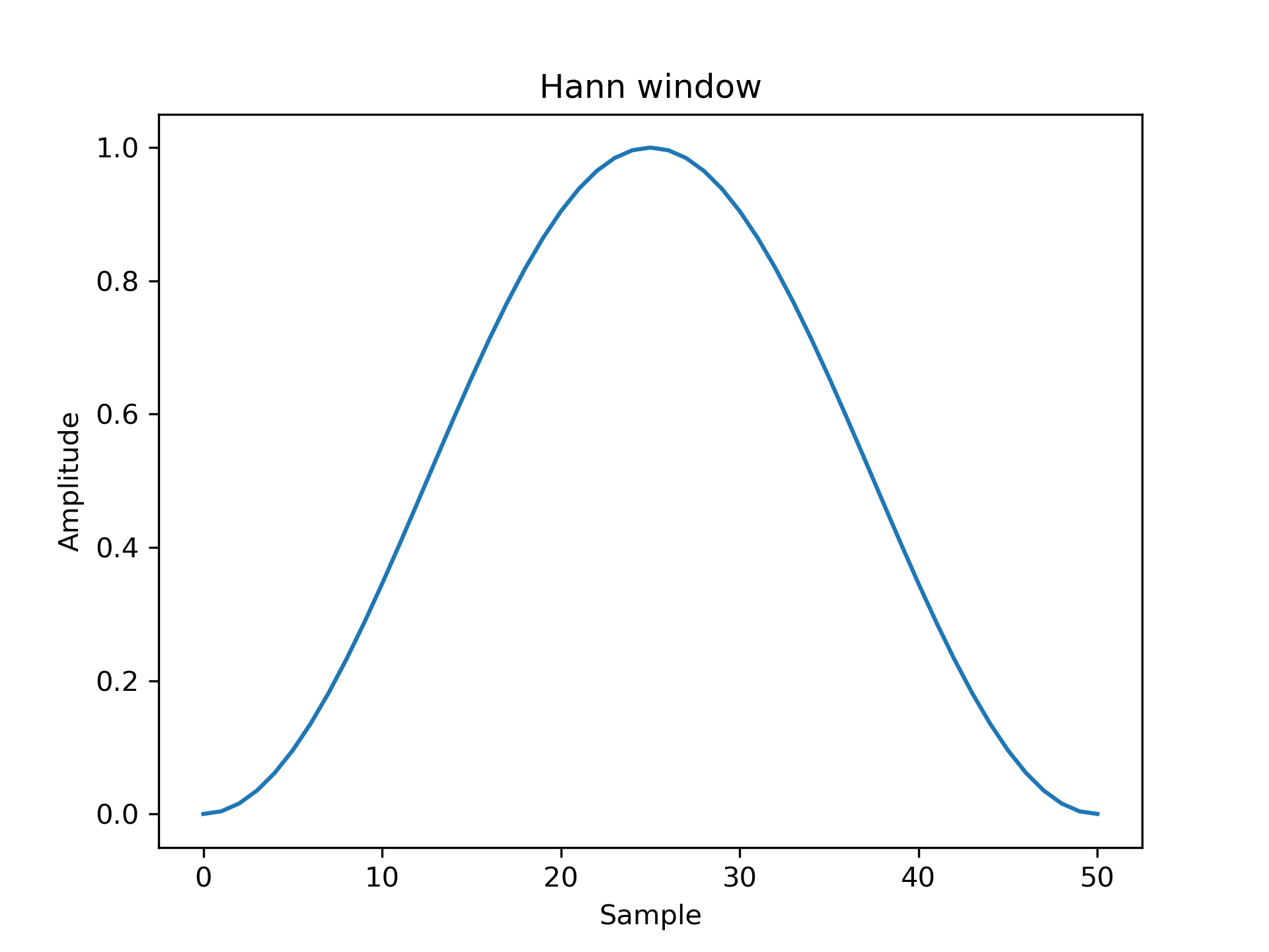
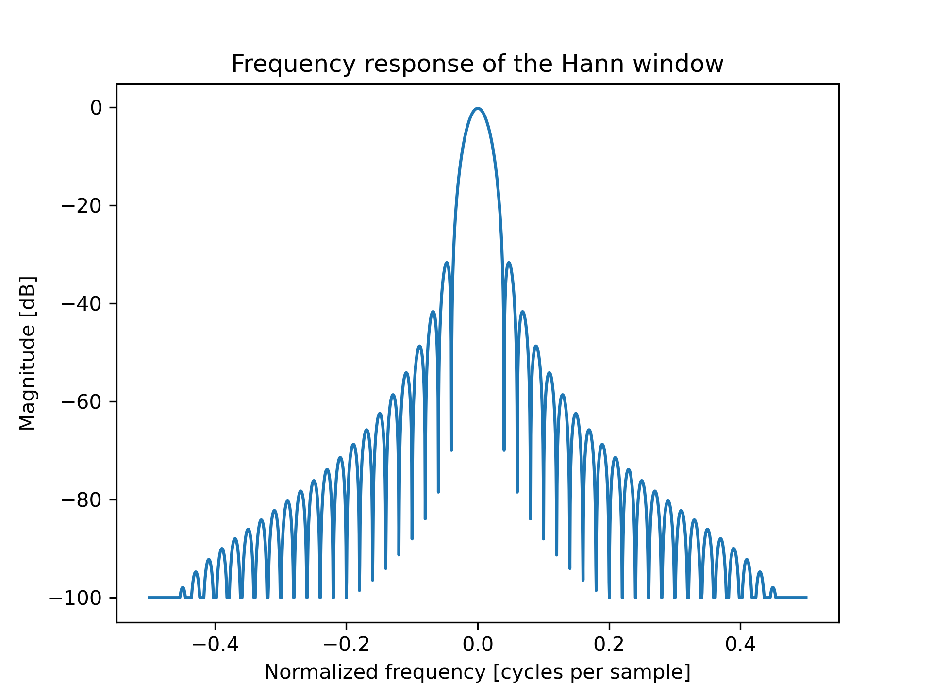
Plot the window and its frequency response:
>>> import matplotlib.pyplot as plt
... from numpy.fft import fft, fftshift
... window = np.hanning(51)
... plt.plot(window)
[<matplotlib.lines.Line2D object at 0x...>]
>>> plt.title("Hann window")
Text(0.5, 1.0, 'Hann window')
>>> plt.ylabel("Amplitude")
Text(0, 0.5, 'Amplitude')
>>> plt.xlabel("Sample")
Text(0.5, 0, 'Sample')
>>> plt.show()
>>> plt.figure()
<Figure size 640x480 with 0 Axes>
>>> A = fft(window, 2048) / 25.5
... mag = np.abs(fftshift(A))
... freq = np.linspace(-0.5, 0.5, len(A))
... with np.errstate(divide='ignore', invalid='ignore'):
...     response = 20 * np.log10(mag)
...
>>> response = np.clip(response, -100, 100)
... plt.plot(freq, response)
[<matplotlib.lines.Line2D object at 0x...>]
>>> plt.title("Frequency response of the Hann window")
Text(0.5, 1.0, 'Frequency response of the Hann window')
>>> plt.ylabel("Magnitude [dB]")
Text(0, 0.5, 'Magnitude [dB]')
>>> plt.xlabel("Normalized frequency [cycles per sample]")
Text(0.5, 0, 'Normalized frequency [cycles per sample]')
>>> plt.axis('tight')
...
>>> plt.show()
The following pages refer to to this document either explicitly or contain code examples using this.
numpy.hamming
numpy.blackman
numpy.bartlett
numpy.kaiser
Hover to see nodes names; edges to Self not shown, Caped at 50 nodes.
Using a canvas is more power efficient and can get hundred of nodes ; but does not allow hyperlinks; , arrows or text (beyond on hover)
SVG is more flexible but power hungry; and does not scale well to 50 + nodes.
All aboves nodes referred to, (or are referred from) current nodes; Edges from Self to other have been omitted (or all nodes would be connected to the central node "self" which is not useful). Nodes are colored by the library they belong to, and scaled with the number of references pointing them