electrocardiogram()
The returned signal is a 5 minute long electrocardiogram (ECG), a medical recording of the heart's electrical activity, sampled at 360 Hz.
The provided signal is an excerpt (19:35 to 24:35) from the `record 208`_ (lead MLII) provided by the MIT-BIH Arrhythmia Database on PhysioNet . The excerpt includes noise induced artifacts, typical heartbeats as well as pathological changes.
<Unimplemented 'target' '.. _record 208: https://physionet.org/physiobank/database/html/mitdbdir/records.htm#208'>
The electrocardiogram in millivolt (mV) sampled at 360 Hz.
Load an electrocardiogram as an example for a 1-D signal.
>>> from scipy.misc import electrocardiogram
... ecg = electrocardiogram()
... ecg
array([-0.245, -0.215, -0.185, ..., -0.405, -0.395, -0.385])
>>> ecg.shape, ecg.mean(), ecg.std()
((108000,), -0.16510875, 0.5992473991177294)
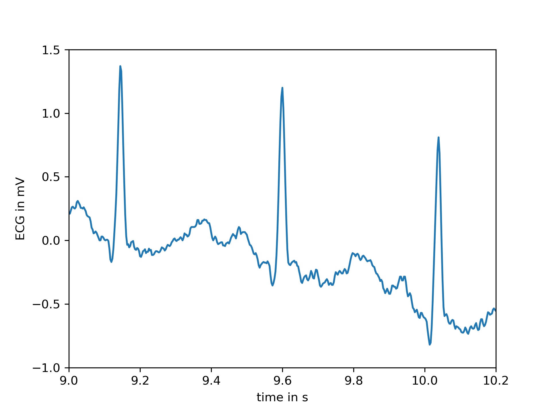
As stated the signal features several areas with a different morphology. E.g., the first few seconds show the electrical activity of a heart in normal sinus rhythm as seen below.
>>> import matplotlib.pyplot as plt
... fs = 360
... time = np.arange(ecg.size) / fs
... plt.plot(time, ecg)
... plt.xlabel("time in s")
... plt.ylabel("ECG in mV")
... plt.xlim(9, 10.2)
... plt.ylim(-1, 1.5)
... plt.show()
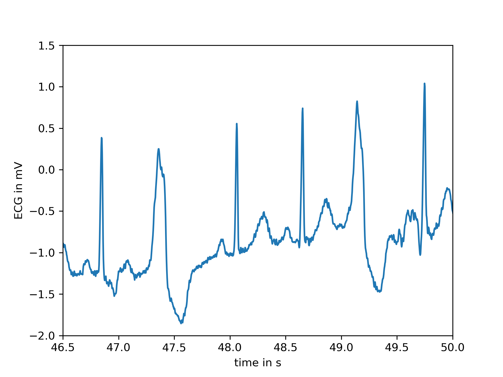
After second 16, however, the first premature ventricular contractions, also called extrasystoles, appear. These have a different morphology compared to typical heartbeats. The difference can easily be observed in the following plot.
>>> plt.plot(time, ecg)
... plt.xlabel("time in s")
... plt.ylabel("ECG in mV")
... plt.xlim(46.5, 50)
... plt.ylim(-2, 1.5)
... plt.show()
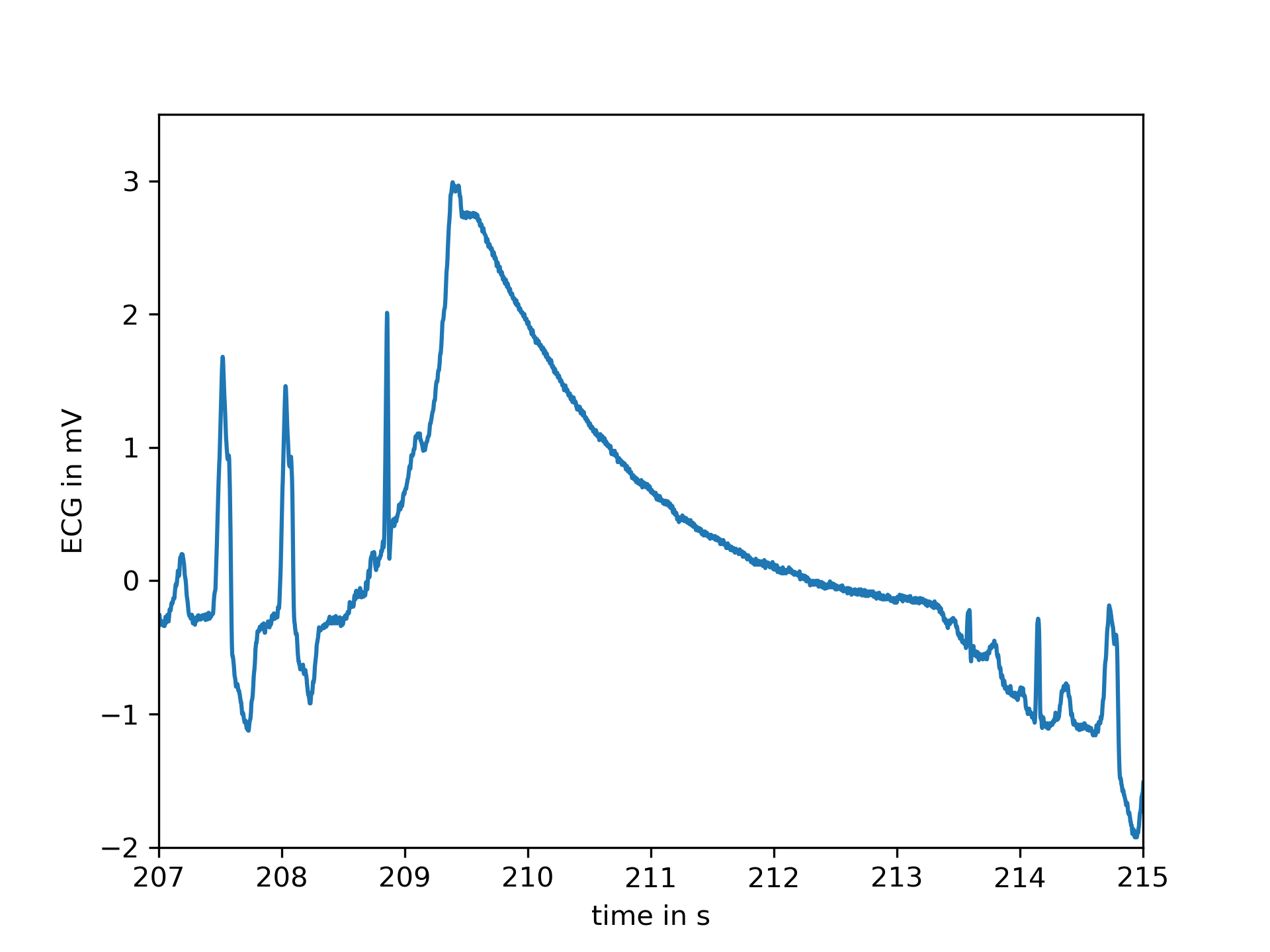
At several points large artifacts disturb the recording, e.g.:
>>> plt.plot(time, ecg)
... plt.xlabel("time in s")
... plt.ylabel("ECG in mV")
... plt.xlim(207, 215)
... plt.ylim(-2, 3.5)
... plt.show()
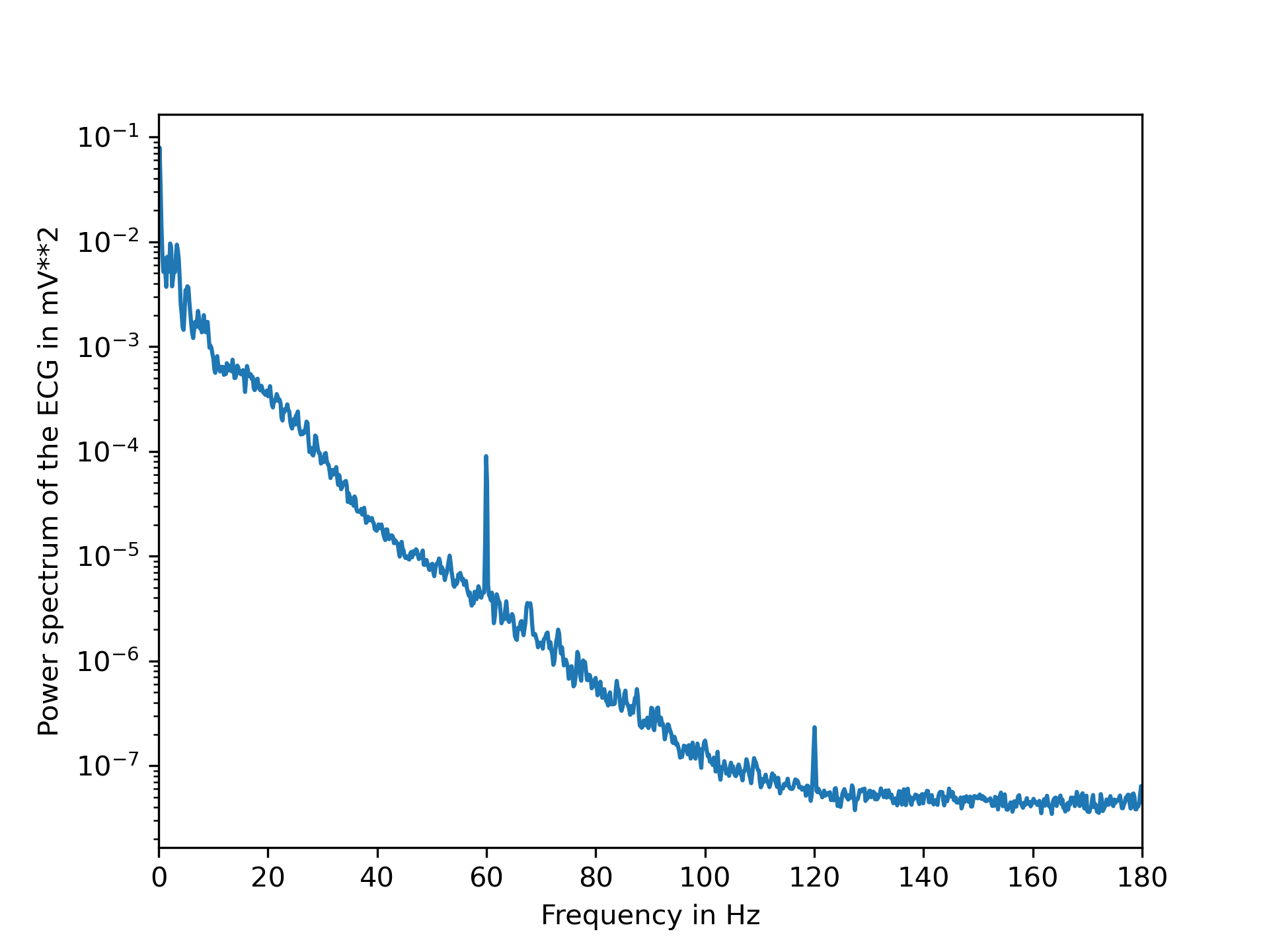
Finally, examining the power spectrum reveals that most of the biosignal is made up of lower frequencies. At 60 Hz the noise induced by the mains electricity can be clearly observed.
>>> from scipy.signal import welch
... f, Pxx = welch(ecg, fs=fs, nperseg=2048, scaling="spectrum")
... plt.semilogy(f, Pxx)
... plt.xlabel("Frequency in Hz")
... plt.ylabel("Power spectrum of the ECG in mV**2")
... plt.xlim(f[[0, -1]])
... plt.show()
The following pages refer to to this document either explicitly or contain code examples using this.
scipy.misc._common.electrocardiogram
scipy.signal._peak_finding.find_peaks
Hover to see nodes names; edges to Self not shown, Caped at 50 nodes.
Using a canvas is more power efficient and can get hundred of nodes ; but does not allow hyperlinks; , arrows or text (beyond on hover)
SVG is more flexible but power hungry; and does not scale well to 50 + nodes.
All aboves nodes referred to, (or are referred from) current nodes; Edges from Self to other have been omitted (or all nodes would be connected to the central node "self" which is not useful). Nodes are colored by the library they belong to, and scaled with the number of references pointing them