>>> """
========
Psd Demo
========
Plotting Power Spectral Density (PSD) in Matplotlib.
The PSD is a common plot in the field of signal processing. NumPy has
many useful libraries for computing a PSD. Below we demo a few examples
of how this can be accomplished and visualized with Matplotlib.
"""
... import matplotlib.pyplot as plt
... import numpy as np
... import matplotlib.mlab as mlab
... import matplotlib.gridspec as gridspec
...
... # Fixing random state for reproducibility
... np.random.seed(19680801)
...
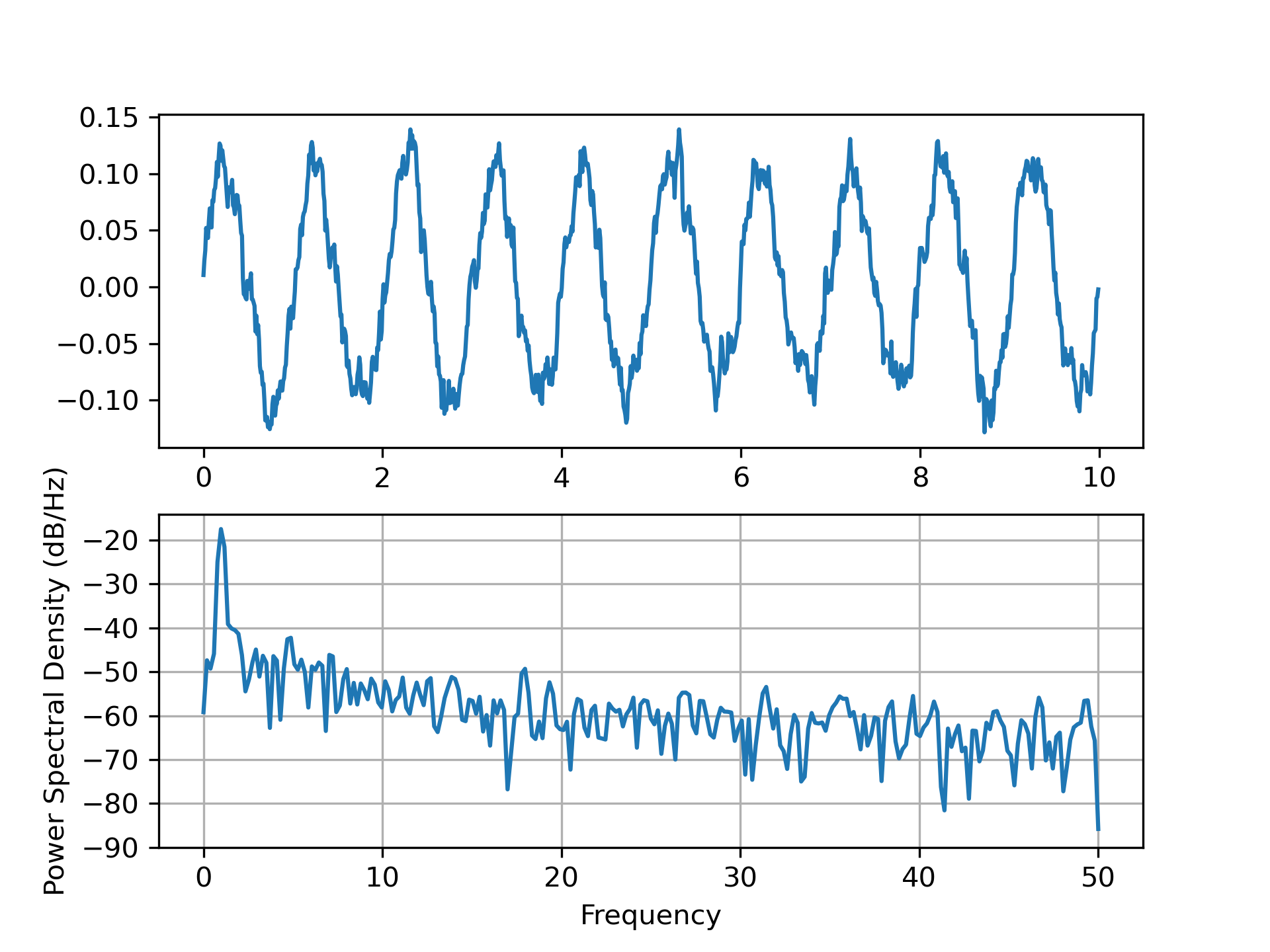
... dt = 0.01
... t = np.arange(0, 10, dt)
... nse = np.random.randn(len(t))
... r = np.exp(-t / 0.05)
...
... cnse = np.convolve(nse, r) * dt
... cnse = cnse[:len(t)]
... s = 0.1 * np.sin(2 * np.pi * t) + cnse
...
... fig, (ax0, ax1) = plt.subplots(2, 1)
... ax0.plot(t, s)
... ax1.psd(s, 512, 1 / dt)
...
... plt.show()
...
... ###############################################################################
... # Compare this with the equivalent Matlab code to accomplish the same thing::
... #
... # dt = 0.01;
... # t = [0:dt:10];
... # nse = randn(size(t));
... # r = exp(-t/0.05);
... # cnse = conv(nse, r)*dt;
... # cnse = cnse(1:length(t));
... # s = 0.1*sin(2*pi*t) + cnse;
... #
... # subplot(211)
... # plot(t, s)
... # subplot(212)
... # psd(s, 512, 1/dt)
... #
... # Below we'll show a slightly more complex example that demonstrates
... # how padding affects the resulting PSD.
...
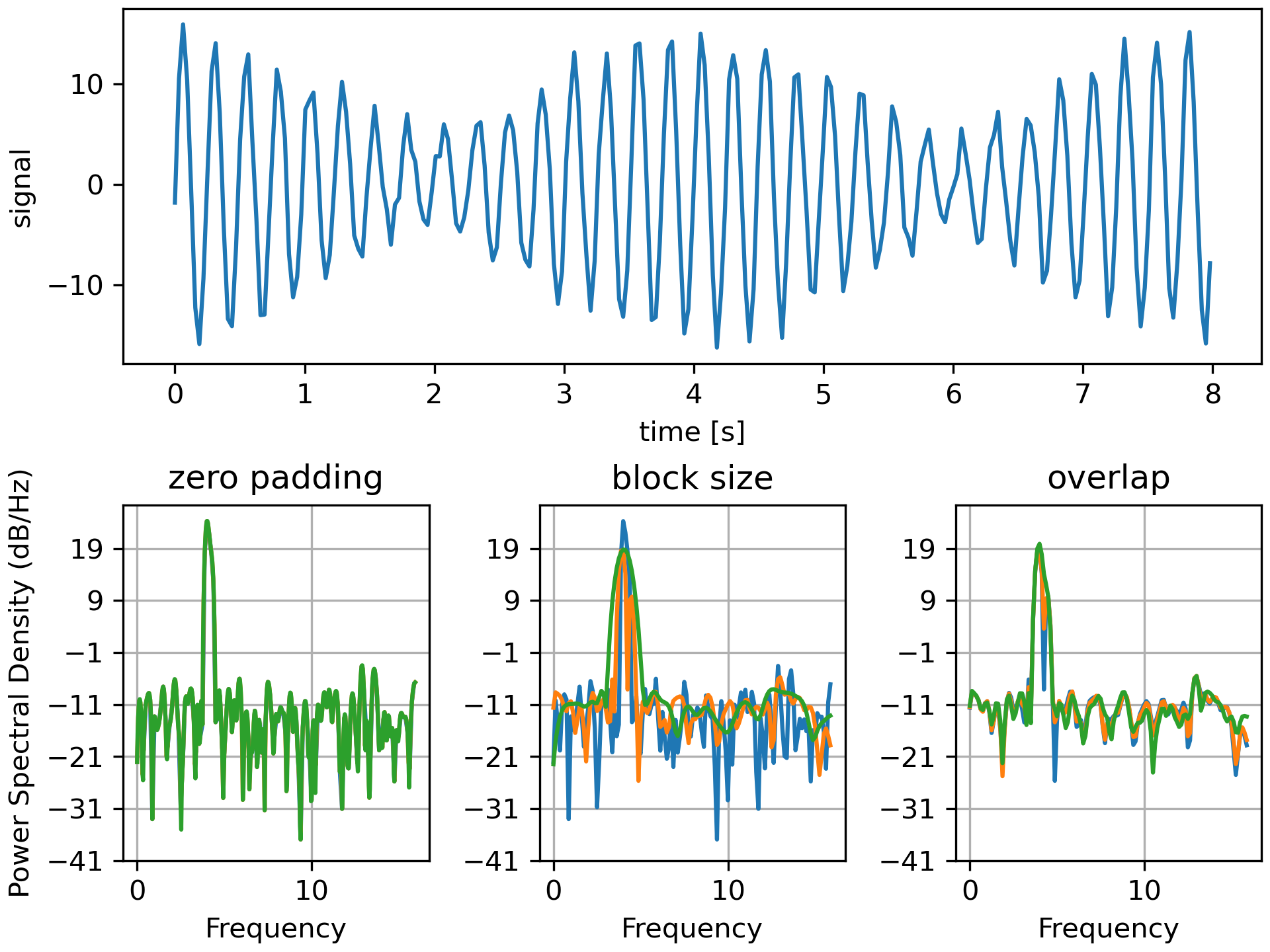
... dt = np.pi / 100.
... fs = 1. / dt
... t = np.arange(0, 8, dt)
... y = 10. * np.sin(2 * np.pi * 4 * t) + 5. * np.sin(2 * np.pi * 4.25 * t)
... y = y + np.random.randn(*t.shape)
...
... # Plot the raw time series
... fig = plt.figure(constrained_layout=True)
... gs = gridspec.GridSpec(2, 3, figure=fig)
... ax = fig.add_subplot(gs[0, :])
... ax.plot(t, y)
... ax.set_xlabel('time [s]')
... ax.set_ylabel('signal')
...
... # Plot the PSD with different amounts of zero padding. This uses the entire
... # time series at once
... ax2 = fig.add_subplot(gs[1, 0])
... ax2.psd(y, NFFT=len(t), pad_to=len(t), Fs=fs)
... ax2.psd(y, NFFT=len(t), pad_to=len(t) * 2, Fs=fs)
... ax2.psd(y, NFFT=len(t), pad_to=len(t) * 4, Fs=fs)
... ax2.set_title('zero padding')
...
... # Plot the PSD with different block sizes, Zero pad to the length of the
... # original data sequence.
... ax3 = fig.add_subplot(gs[1, 1], sharex=ax2, sharey=ax2)
... ax3.psd(y, NFFT=len(t), pad_to=len(t), Fs=fs)
... ax3.psd(y, NFFT=len(t) // 2, pad_to=len(t), Fs=fs)
... ax3.psd(y, NFFT=len(t) // 4, pad_to=len(t), Fs=fs)
... ax3.set_ylabel('')
... ax3.set_title('block size')
...
... # Plot the PSD with different amounts of overlap between blocks
... ax4 = fig.add_subplot(gs[1, 2], sharex=ax2, sharey=ax2)
... ax4.psd(y, NFFT=len(t) // 2, pad_to=len(t), noverlap=0, Fs=fs)
... ax4.psd(y, NFFT=len(t) // 2, pad_to=len(t),
... noverlap=int(0.05 * len(t) / 2.), Fs=fs)
... ax4.psd(y, NFFT=len(t) // 2, pad_to=len(t),
... noverlap=int(0.2 * len(t) / 2.), Fs=fs)
... ax4.set_ylabel('')
... ax4.set_title('overlap')
...
... plt.show()
...
...
... ###############################################################################
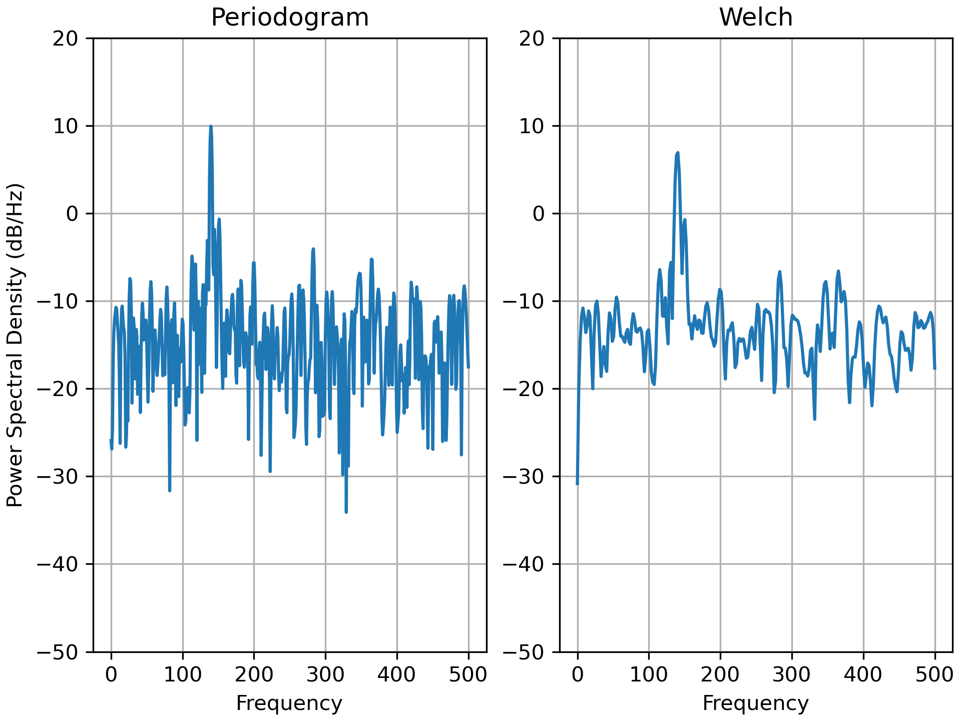
... # This is a ported version of a MATLAB example from the signal
... # processing toolbox that showed some difference at one time between
... # Matplotlib's and MATLAB's scaling of the PSD.
...
... fs = 1000
... t = np.linspace(0, 0.3, 301)
... A = np.array([2, 8]).reshape(-1, 1)
... f = np.array([150, 140]).reshape(-1, 1)
... xn = (A * np.sin(2 * np.pi * f * t)).sum(axis=0)
... xn += 5 * np.random.randn(*t.shape)
...
... fig, (ax0, ax1) = plt.subplots(ncols=2, constrained_layout=True)
...
... yticks = np.arange(-50, 30, 10)
... yrange = (yticks[0], yticks[-1])
... xticks = np.arange(0, 550, 100)
...
... ax0.psd(xn, NFFT=301, Fs=fs, window=mlab.window_none, pad_to=1024,
... scale_by_freq=True)
... ax0.set_title('Periodogram')
... ax0.set_yticks(yticks)
... ax0.set_xticks(xticks)
... ax0.grid(True)
... ax0.set_ylim(yrange)
...
... ax1.psd(xn, NFFT=150, Fs=fs, window=mlab.window_none, pad_to=512, noverlap=75,
... scale_by_freq=True)
... ax1.set_title('Welch')
... ax1.set_xticks(xticks)
... ax1.set_yticks(yticks)
... ax1.set_ylabel('') # overwrite the y-label added by `psd`
... ax1.grid(True)
... ax1.set_ylim(yrange)
...
... plt.show()
...
... ###############################################################################
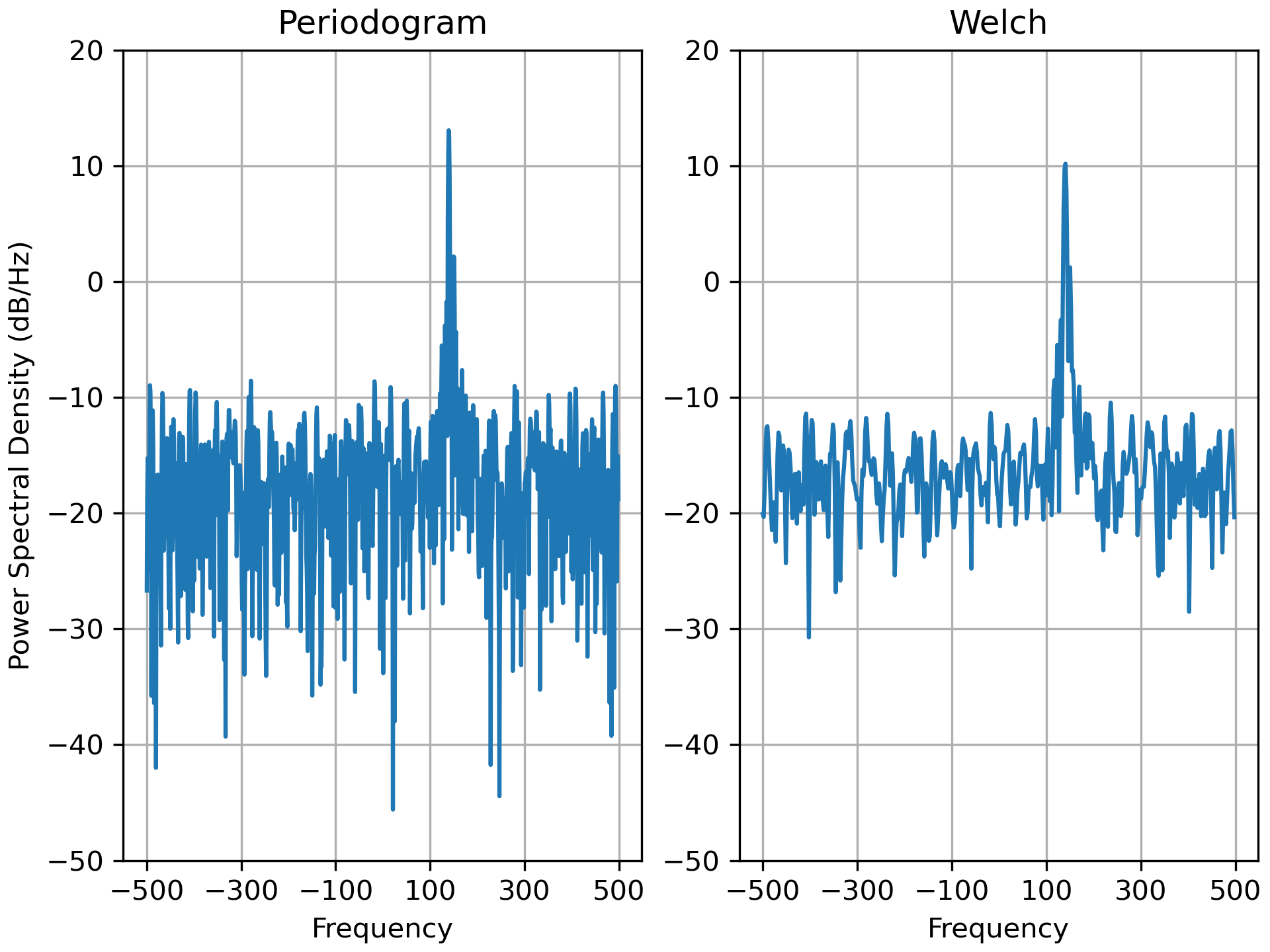
... # This is a ported version of a MATLAB example from the signal
... # processing toolbox that showed some difference at one time between
... # Matplotlib's and MATLAB's scaling of the PSD.
... #
... # It uses a complex signal so we can see that complex PSD's work properly.
...
... prng = np.random.RandomState(19680801) # to ensure reproducibility
...
... fs = 1000
... t = np.linspace(0, 0.3, 301)
... A = np.array([2, 8]).reshape(-1, 1)
... f = np.array([150, 140]).reshape(-1, 1)
... xn = (A * np.exp(2j * np.pi * f * t)).sum(axis=0) + 5 * prng.randn(*t.shape)
...
... fig, (ax0, ax1) = plt.subplots(ncols=2, constrained_layout=True)
...
... yticks = np.arange(-50, 30, 10)
... yrange = (yticks[0], yticks[-1])
... xticks = np.arange(-500, 550, 200)
...
... ax0.psd(xn, NFFT=301, Fs=fs, window=mlab.window_none, pad_to=1024,
... scale_by_freq=True)
... ax0.set_title('Periodogram')
... ax0.set_yticks(yticks)
... ax0.set_xticks(xticks)
... ax0.grid(True)
... ax0.set_ylim(yrange)
...
... ax1.psd(xn, NFFT=150, Fs=fs, window=mlab.window_none, pad_to=512, noverlap=75,
... scale_by_freq=True)
... ax1.set_title('Welch')
... ax1.set_xticks(xticks)
... ax1.set_yticks(yticks)
... ax1.set_ylabel('') # overwrite the y-label added by `psd`
... ax1.grid(True)
... ax1.set_ylim(yrange)
...
... plt.show()
...