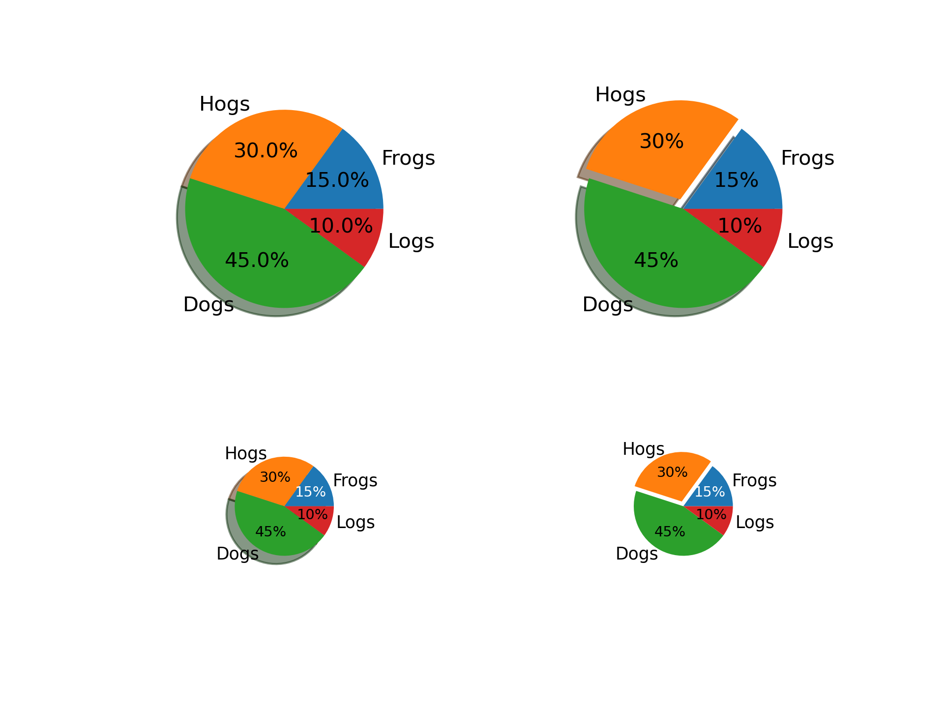
>>> """
=========
Pie Demo2
=========

Make a pie charts using `~.axes.Axes.pie`.

This example demonstrates some pie chart features like labels, varying size,
autolabeling the percentage, offsetting a slice and adding a shadow.
"""
...
... import matplotlib.pyplot as plt
...
... # Some data
... labels = 'Frogs', 'Hogs', 'Dogs', 'Logs'
... fracs = [15, 30, 45, 10]
...
... # Make figure and axes
... fig, axs = plt.subplots(2, 2)
...
... # A standard pie plot
... axs[0, 0].pie(fracs, labels=labels, autopct='%1.1f%%', shadow=True)
...
... # Shift the second slice using explode
... axs[0, 1].pie(fracs, labels=labels, autopct='%.0f%%', shadow=True,
...               explode=(0, 0.1, 0, 0))
...
... # Adapt radius and text size for a smaller pie
... patches, texts, autotexts = axs[1, 0].pie(fracs, labels=labels,
...                                           autopct='%.0f%%',
...                                           textprops={'size': 'smaller'},
...                                           shadow=True, radius=0.5)
... # Make percent texts even smaller
... plt.setp(autotexts, size='x-small')
... autotexts[0].set_color('white')
...
... # Use a smaller explode and turn of the shadow for better visibility
... patches, texts, autotexts = axs[1, 1].pie(fracs, labels=labels,
...                                           autopct='%.0f%%',
...                                           textprops={'size': 'smaller'},
...                                           shadow=False, radius=0.5,
...                                           explode=(0, 0.05, 0, 0))
... plt.setp(autotexts, size='x-small')
... autotexts[0].set_color('white')
...
... plt.show()
...
... #############################################################################
... #
... # .. admonition:: References
... #
... #    The use of the following functions, methods, classes and modules is shown
... #    in this example:
... #
... #    - `matplotlib.axes.Axes.pie` / `matplotlib.pyplot.pie`
...