>>> """
===========
Pcolor Demo
===========
Generating images with `~.axes.Axes.pcolor`.
Pcolor allows you to generate 2D image-style plots. Below we will show how
to do so in Matplotlib.
"""
... import matplotlib.pyplot as plt
... import numpy as np
... from matplotlib.colors import LogNorm
...
...
... # Fixing random state for reproducibility
... np.random.seed(19680801)
...
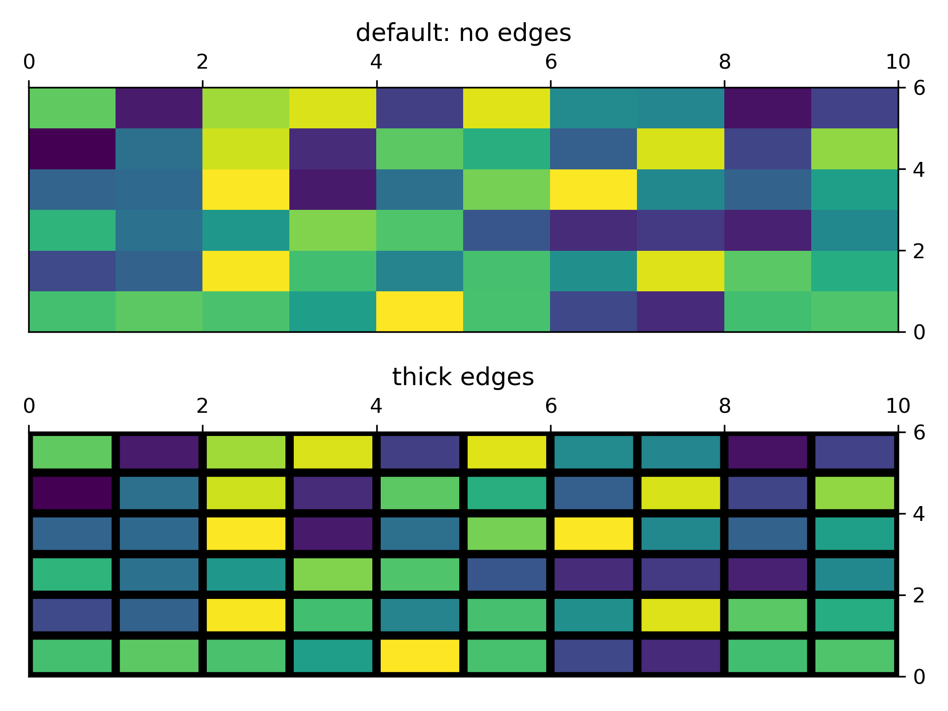
... ###############################################################################
... # A simple pcolor demo
... # --------------------
...
... Z = np.random.rand(6, 10)
...
... fig, (ax0, ax1) = plt.subplots(2, 1)
...
... c = ax0.pcolor(Z)
... ax0.set_title('default: no edges')
...
... c = ax1.pcolor(Z, edgecolors='k', linewidths=4)
... ax1.set_title('thick edges')
...
... fig.tight_layout()
... plt.show()
...
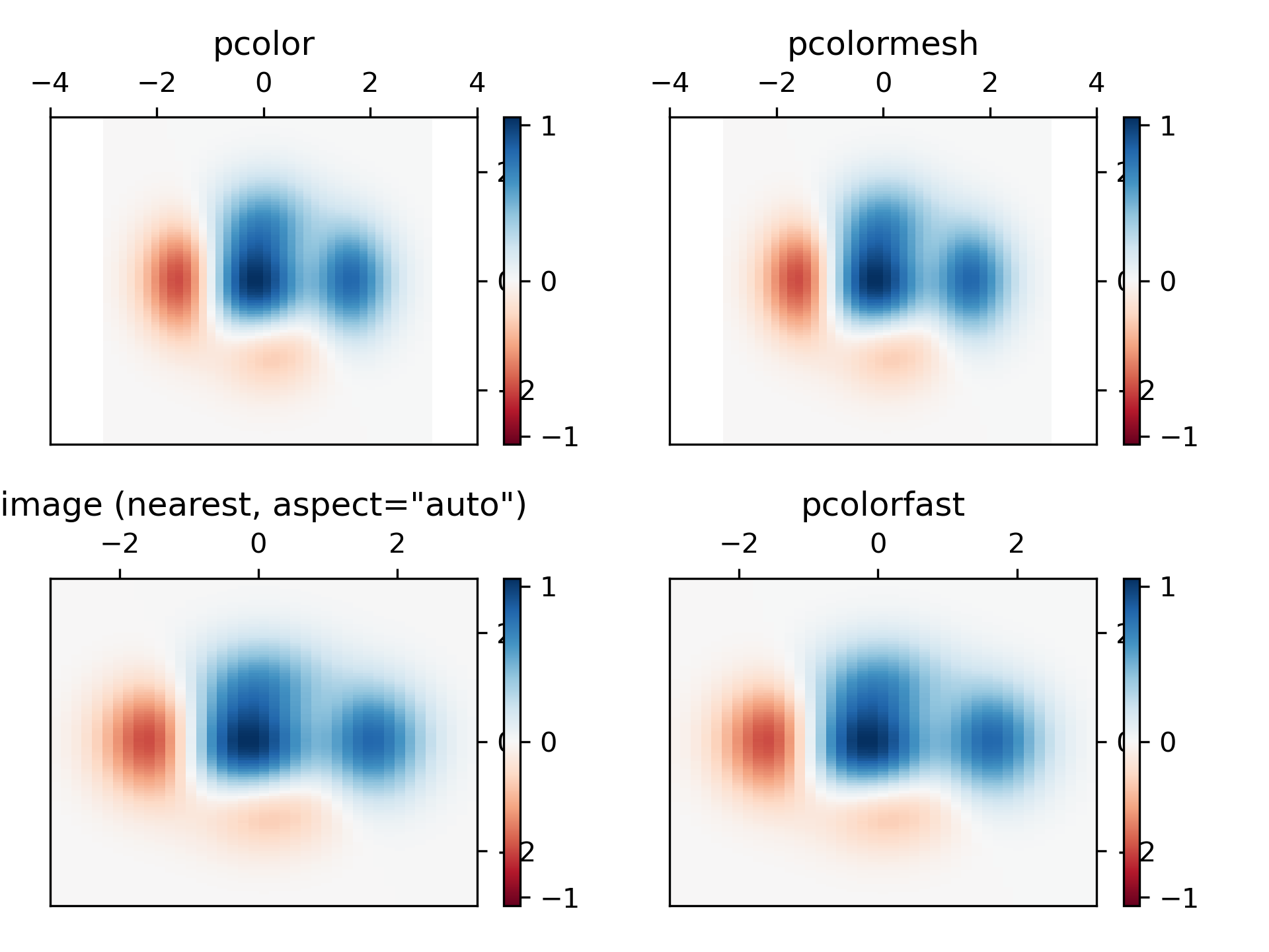
... ###############################################################################
... # Comparing pcolor with similar functions
... # ---------------------------------------
... #
... # Demonstrates similarities between `~.axes.Axes.pcolor`,
... # `~.axes.Axes.pcolormesh`, `~.axes.Axes.imshow` and
... # `~.axes.Axes.pcolorfast` for drawing quadrilateral grids.
... # Note that we call ``imshow`` with ``aspect="auto"`` so that it doesn't force
... # the data pixels to be square (the default is ``aspect="equal"``).
...
... # make these smaller to increase the resolution
... dx, dy = 0.15, 0.05
...
... # generate 2 2d grids for the x & y bounds
... y, x = np.mgrid[-3:3+dy:dy, -3:3+dx:dx]
... z = (1 - x/2 + x**5 + y**3) * np.exp(-x**2 - y**2)
... # x and y are bounds, so z should be the value *inside* those bounds.
... # Therefore, remove the last value from the z array.
... z = z[:-1, :-1]
... z_min, z_max = -abs(z).max(), abs(z).max()
...
... fig, axs = plt.subplots(2, 2)
...
... ax = axs[0, 0]
... c = ax.pcolor(x, y, z, cmap='RdBu', vmin=z_min, vmax=z_max)
... ax.set_title('pcolor')
... fig.colorbar(c, ax=ax)
...
... ax = axs[0, 1]
... c = ax.pcolormesh(x, y, z, cmap='RdBu', vmin=z_min, vmax=z_max)
... ax.set_title('pcolormesh')
... fig.colorbar(c, ax=ax)
...
... ax = axs[1, 0]
... c = ax.imshow(z, cmap='RdBu', vmin=z_min, vmax=z_max,
... extent=[x.min(), x.max(), y.min(), y.max()],
... interpolation='nearest', origin='lower', aspect='auto')
... ax.set_title('image (nearest, aspect="auto")')
... fig.colorbar(c, ax=ax)
...
... ax = axs[1, 1]
... c = ax.pcolorfast(x, y, z, cmap='RdBu', vmin=z_min, vmax=z_max)
... ax.set_title('pcolorfast')
... fig.colorbar(c, ax=ax)
...
... fig.tight_layout()
... plt.show()
...
...
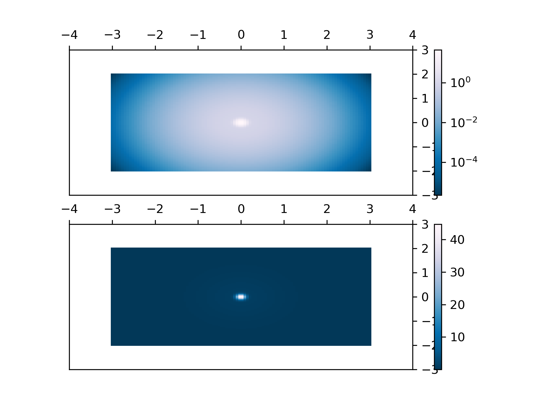
... ###############################################################################
... # Pcolor with a log scale
... # -----------------------
... #
... # The following shows pcolor plots with a log scale.
...
... N = 100
... X, Y = np.meshgrid(np.linspace(-3, 3, N), np.linspace(-2, 2, N))
...
... # A low hump with a spike coming out.
... # Needs to have z/colour axis on a log scale so we see both hump and spike.
... # linear scale only shows the spike.
... Z1 = np.exp(-X**2 - Y**2)
... Z2 = np.exp(-(X * 10)**2 - (Y * 10)**2)
... Z = Z1 + 50 * Z2
...
... fig, (ax0, ax1) = plt.subplots(2, 1)
...
... c = ax0.pcolor(X, Y, Z, shading='auto',
... norm=LogNorm(vmin=Z.min(), vmax=Z.max()), cmap='PuBu_r')
... fig.colorbar(c, ax=ax0)
...
... c = ax1.pcolor(X, Y, Z, cmap='PuBu_r', shading='auto')
... fig.colorbar(c, ax=ax1)
...
... plt.show()
...
... #############################################################################
... #
... # .. admonition:: References
... #
... # The use of the following functions, methods, classes and modules is shown
... # in this example:
... #
... # - `matplotlib.axes.Axes.pcolor` / `matplotlib.pyplot.pcolor`
... # - `matplotlib.axes.Axes.pcolormesh` / `matplotlib.pyplot.pcolormesh`
... # - `matplotlib.axes.Axes.pcolorfast`
... # - `matplotlib.axes.Axes.imshow` / `matplotlib.pyplot.imshow`
... # - `matplotlib.figure.Figure.colorbar` / `matplotlib.pyplot.colorbar`
... # - `matplotlib.colors.LogNorm`
...