>>> """
=================
Nested pie charts
=================
The following examples show two ways to build a nested pie chart
in Matplotlib. Such charts are often referred to as donut charts.
"""
...
... import matplotlib.pyplot as plt
... import numpy as np
...
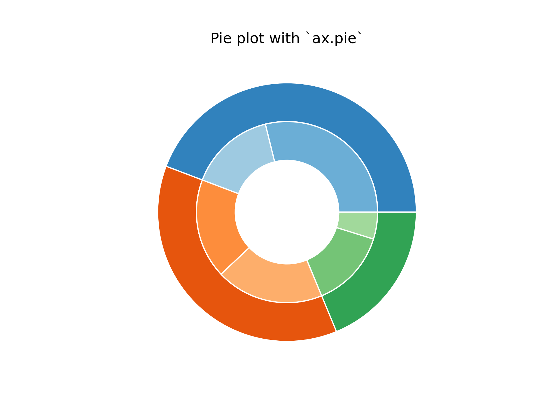
... ###############################################################################
... # The most straightforward way to build a pie chart is to use the
... # `~matplotlib.axes.Axes.pie` method.
... #
... # In this case, pie takes values corresponding to counts in a group.
... # We'll first generate some fake data, corresponding to three groups.
... # In the inner circle, we'll treat each number as belonging to its
... # own group. In the outer circle, we'll plot them as members of their
... # original 3 groups.
... #
... # The effect of the donut shape is achieved by setting a ``width`` to
... # the pie's wedges through the *wedgeprops* argument.
...
...
... fig, ax = plt.subplots()
...
... size = 0.3
... vals = np.array([[60., 32.], [37., 40.], [29., 10.]])
...
... cmap = plt.colormaps["tab20c"]
... outer_colors = cmap(np.arange(3)*4)
... inner_colors = cmap([1, 2, 5, 6, 9, 10])
...
... ax.pie(vals.sum(axis=1), radius=1, colors=outer_colors,
... wedgeprops=dict(width=size, edgecolor='w'))
...
... ax.pie(vals.flatten(), radius=1-size, colors=inner_colors,
... wedgeprops=dict(width=size, edgecolor='w'))
...
... ax.set(aspect="equal", title='Pie plot with `ax.pie`')
... plt.show()
...
... ###############################################################################
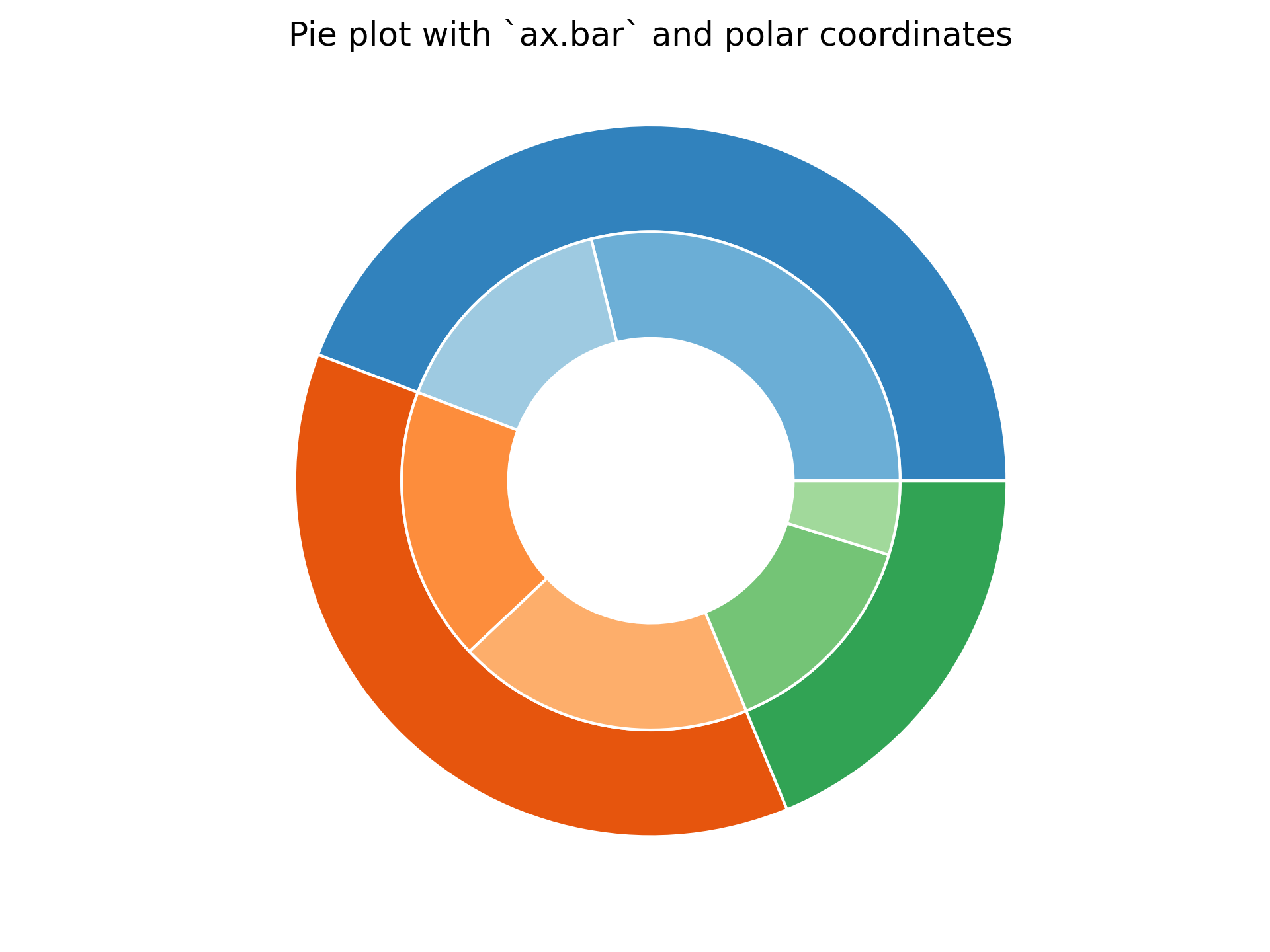
... # However, you can accomplish the same output by using a bar plot on
... # axes with a polar coordinate system. This may give more flexibility on
... # the exact design of the plot.
... #
... # In this case, we need to map x-values of the bar chart onto radians of
... # a circle. The cumulative sum of the values are used as the edges
... # of the bars.
...
... fig, ax = plt.subplots(subplot_kw=dict(projection="polar"))
...
... size = 0.3
... vals = np.array([[60., 32.], [37., 40.], [29., 10.]])
... # Normalize vals to 2 pi
... valsnorm = vals/np.sum(vals)*2*np.pi
... # Obtain the ordinates of the bar edges
... valsleft = np.cumsum(np.append(0, valsnorm.flatten()[:-1])).reshape(vals.shape)
...
... cmap = plt.colormaps["tab20c"]
... outer_colors = cmap(np.arange(3)*4)
... inner_colors = cmap([1, 2, 5, 6, 9, 10])
...
... ax.bar(x=valsleft[:, 0],
... width=valsnorm.sum(axis=1), bottom=1-size, height=size,
... color=outer_colors, edgecolor='w', linewidth=1, align="edge")
...
... ax.bar(x=valsleft.flatten(),
... width=valsnorm.flatten(), bottom=1-2*size, height=size,
... color=inner_colors, edgecolor='w', linewidth=1, align="edge")
...
... ax.set(title="Pie plot with `ax.bar` and polar coordinates")
... ax.set_axis_off()
... plt.show()
...
... #############################################################################
... #
... # .. admonition:: References
... #
... # The use of the following functions, methods, classes and modules is shown
... # in this example:
... #
... # - `matplotlib.axes.Axes.pie` / `matplotlib.pyplot.pie`
... # - `matplotlib.axes.Axes.bar` / `matplotlib.pyplot.bar`
... # - `matplotlib.projections.polar`
... # - ``Axes.set`` (`matplotlib.artist.Artist.set`)
... # - `matplotlib.axes.Axes.set_axis_off`
...