>>> """
==========================================
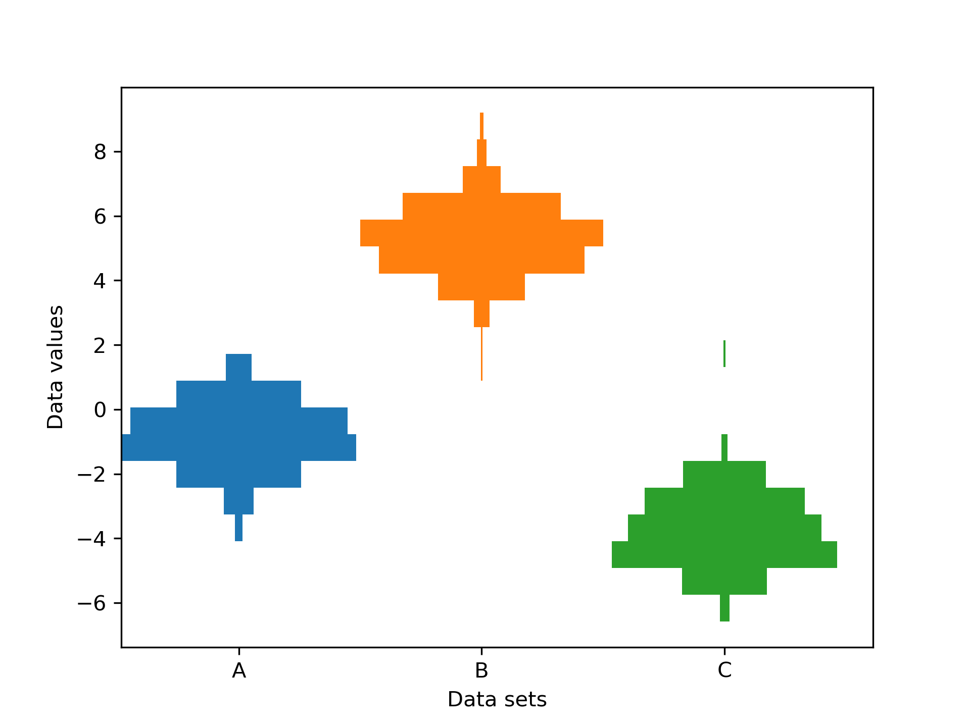
Producing multiple histograms side by side
==========================================
This example plots horizontal histograms of different samples along
a categorical x-axis. Additionally, the histograms are plotted to
be symmetrical about their x-position, thus making them very similar
to violin plots.
To make this highly specialized plot, we can't use the standard ``hist``
method. Instead we use ``barh`` to draw the horizontal bars directly. The
vertical positions and lengths of the bars are computed via the
``np.histogram`` function. The histograms for all the samples are
computed using the same range (min and max values) and number of bins,
so that the bins for each sample are in the same vertical positions.
Selecting different bin counts and sizes can significantly affect the
shape of a histogram. The Astropy docs have a great section on how to
select these parameters:
http://docs.astropy.org/en/stable/visualization/histogram.html
"""
...
... import numpy as np
... import matplotlib.pyplot as plt
...
... np.random.seed(19680801)
... number_of_bins = 20
...
... # An example of three data sets to compare
... number_of_data_points = 387
... labels = ["A", "B", "C"]
... data_sets = [np.random.normal(0, 1, number_of_data_points),
... np.random.normal(6, 1, number_of_data_points),
... np.random.normal(-3, 1, number_of_data_points)]
...
... # Computed quantities to aid plotting
... hist_range = (np.min(data_sets), np.max(data_sets))
... binned_data_sets = [
... np.histogram(d, range=hist_range, bins=number_of_bins)[0]
... for d in data_sets
... ]
... binned_maximums = np.max(binned_data_sets, axis=1)
... x_locations = np.arange(0, sum(binned_maximums), np.max(binned_maximums))
...
... # The bin_edges are the same for all of the histograms
... bin_edges = np.linspace(hist_range[0], hist_range[1], number_of_bins + 1)
... centers = 0.5 * (bin_edges + np.roll(bin_edges, 1))[:-1]
... heights = np.diff(bin_edges)
...
... # Cycle through and plot each histogram
... fig, ax = plt.subplots()
... for x_loc, binned_data in zip(x_locations, binned_data_sets):
... lefts = x_loc - 0.5 * binned_data
... ax.barh(centers, binned_data, height=heights, left=lefts)
...
... ax.set_xticks(x_locations, labels)
...
... ax.set_ylabel("Data values")
... ax.set_xlabel("Data sets")
...
... plt.show()
...
... #############################################################################
... #
... # .. admonition:: References
... #
... # The use of the following functions, methods, classes and modules is shown
... # in this example:
... #
... # - `matplotlib.axes.Axes.barh` / `matplotlib.pyplot.barh`
...