>>> """
=============================================
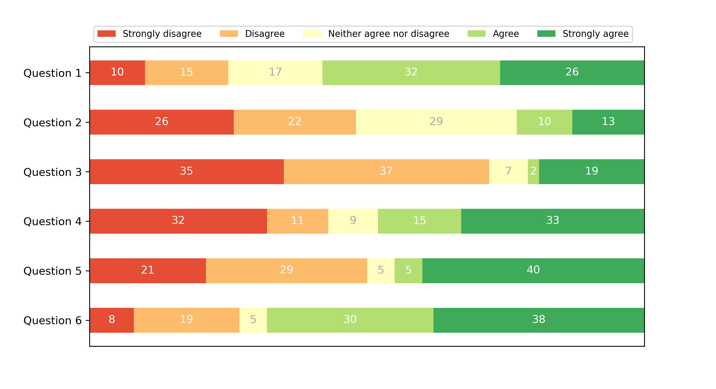
Discrete distribution as horizontal bar chart
=============================================
Stacked bar charts can be used to visualize discrete distributions.
This example visualizes the result of a survey in which people could rate
their agreement to questions on a five-element scale.
The horizontal stacking is achieved by calling `~.Axes.barh()` for each
category and passing the starting point as the cumulative sum of the
already drawn bars via the parameter ``left``.
"""
...
... import numpy as np
... import matplotlib.pyplot as plt
...
...
... category_names = ['Strongly disagree', 'Disagree',
... 'Neither agree nor disagree', 'Agree', 'Strongly agree']
... results = {
... 'Question 1': [10, 15, 17, 32, 26],
... 'Question 2': [26, 22, 29, 10, 13],
... 'Question 3': [35, 37, 7, 2, 19],
... 'Question 4': [32, 11, 9, 15, 33],
... 'Question 5': [21, 29, 5, 5, 40],
... 'Question 6': [8, 19, 5, 30, 38]
... }
...
...
... def survey(results, category_names):
... """
Parameters
----------
results : dict
A mapping from question labels to a list of answers per category.
It is assumed all lists contain the same number of entries and that
it matches the length of *category_names*.
category_names : list of str
The category labels.
"""
... labels = list(results.keys())
... data = np.array(list(results.values()))
... data_cum = data.cumsum(axis=1)
... category_colors = plt.colormaps['RdYlGn'](
... np.linspace(0.15, 0.85, data.shape[1]))
...
... fig, ax = plt.subplots(figsize=(9.2, 5))
... ax.invert_yaxis()
... ax.xaxis.set_visible(False)
... ax.set_xlim(0, np.sum(data, axis=1).max())
...
... for i, (colname, color) in enumerate(zip(category_names, category_colors)):
... widths = data[:, i]
... starts = data_cum[:, i] - widths
... rects = ax.barh(labels, widths, left=starts, height=0.5,
... label=colname, color=color)
...
... r, g, b, _ = color
... text_color = 'white' if r * g * b < 0.5 else 'darkgrey'
... ax.bar_label(rects, label_type='center', color=text_color)
... ax.legend(ncol=len(category_names), bbox_to_anchor=(0, 1),
... loc='lower left', fontsize='small')
...
... return fig, ax
...
...
... survey(results, category_names)
... plt.show()
...
... #############################################################################
... #
... # .. admonition:: References
... #
... # The use of the following functions, methods, classes and modules is shown
... # in this example:
... #
... # - `matplotlib.axes.Axes.barh` / `matplotlib.pyplot.barh`
... # - `matplotlib.axes.Axes.bar_label` / `matplotlib.pyplot.bar_label`
... # - `matplotlib.axes.Axes.legend` / `matplotlib.pyplot.legend`
...