>>> """
=======================
Colormap Normalizations
=======================
Demonstration of using norm to map colormaps onto data in non-linear ways.
"""
...
... import numpy as np
... import matplotlib.pyplot as plt
... import matplotlib.colors as colors
...
... ###############################################################################
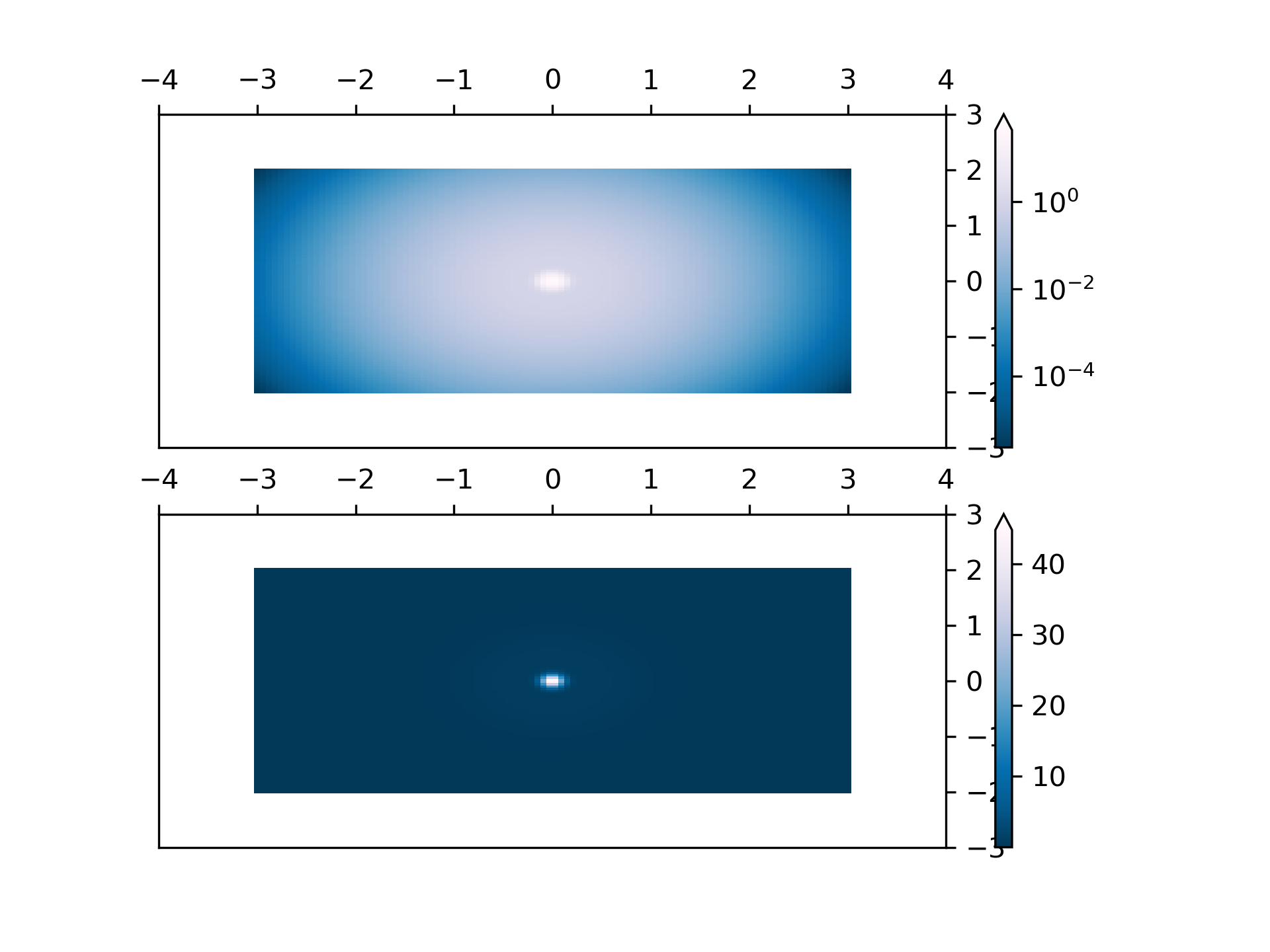
... # Lognorm: Instead of pcolor log10(Z1) you can have colorbars that have
... # the exponential labels using a norm.
...
... N = 100
... X, Y = np.mgrid[-3:3:complex(0, N), -2:2:complex(0, N)]
...
... # A low hump with a spike coming out of the top. Needs to have
... # z/colour axis on a log scale so we see both hump and spike. linear
... # scale only shows the spike.
...
... Z1 = np.exp(-X**2 - Y**2)
... Z2 = np.exp(-(X * 10)**2 - (Y * 10)**2)
... Z = Z1 + 50 * Z2
...
... fig, ax = plt.subplots(2, 1)
...
... pcm = ax[0].pcolor(X, Y, Z,
... norm=colors.LogNorm(vmin=Z.min(), vmax=Z.max()),
... cmap='PuBu_r', shading='nearest')
... fig.colorbar(pcm, ax=ax[0], extend='max')
...
... pcm = ax[1].pcolor(X, Y, Z, cmap='PuBu_r', shading='nearest')
... fig.colorbar(pcm, ax=ax[1], extend='max')
...
...
... ###############################################################################
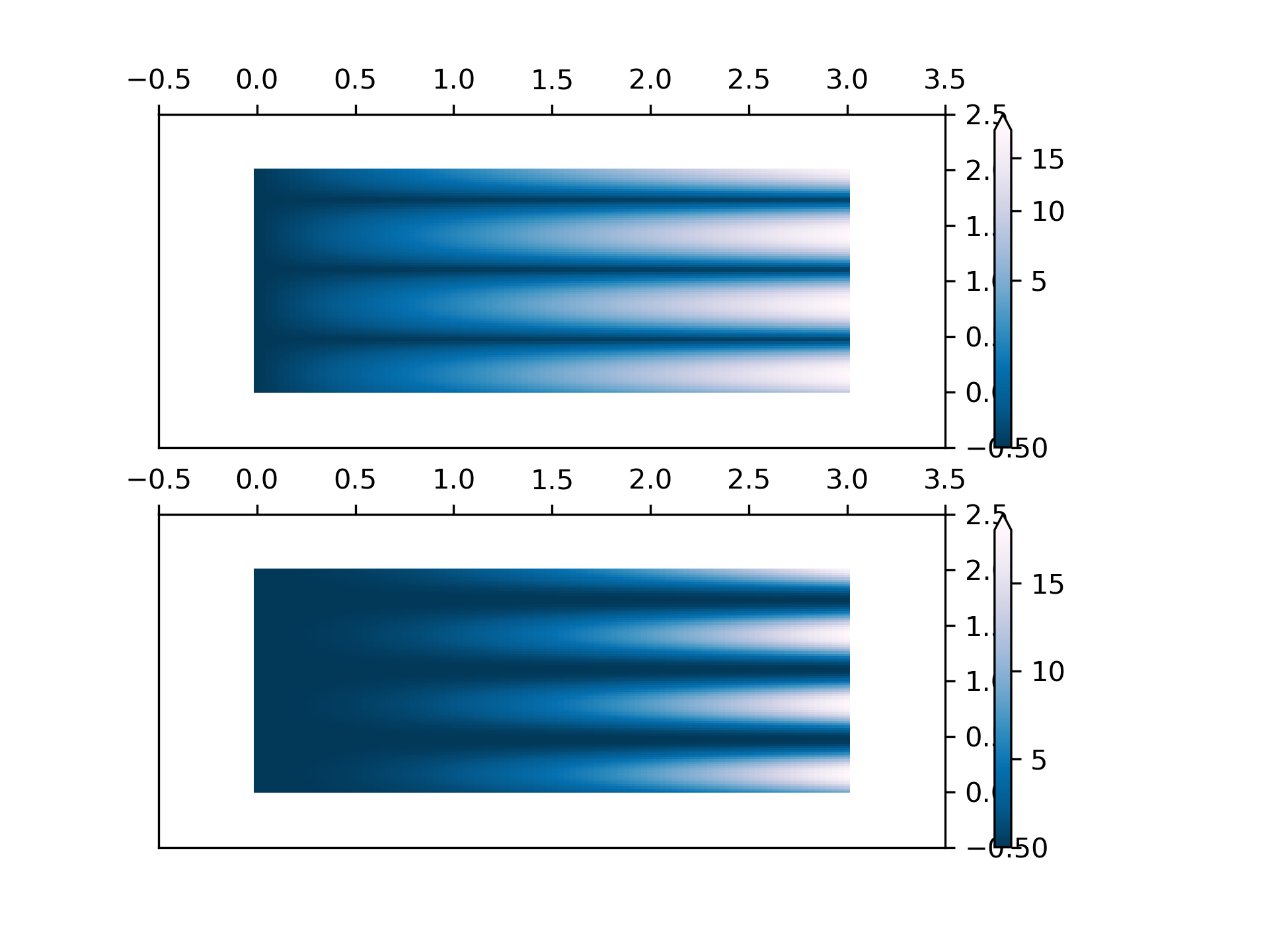
... # PowerNorm: Here a power-law trend in X partially obscures a rectified
... # sine wave in Y. We can remove the power law using a PowerNorm.
...
... X, Y = np.mgrid[0:3:complex(0, N), 0:2:complex(0, N)]
... Z1 = (1 + np.sin(Y * 10.)) * X**2
...
... fig, ax = plt.subplots(2, 1)
...
... pcm = ax[0].pcolormesh(X, Y, Z1, norm=colors.PowerNorm(gamma=1. / 2.),
... cmap='PuBu_r', shading='nearest')
... fig.colorbar(pcm, ax=ax[0], extend='max')
...
... pcm = ax[1].pcolormesh(X, Y, Z1, cmap='PuBu_r', shading='nearest')
... fig.colorbar(pcm, ax=ax[1], extend='max')
...
... ###############################################################################
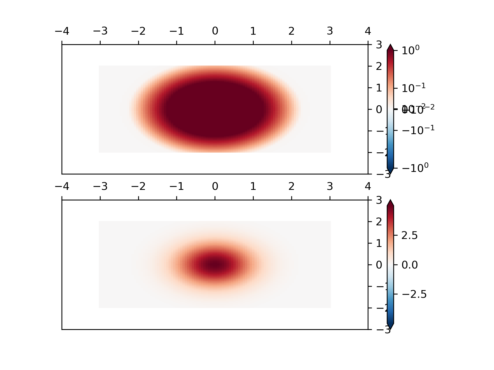
... # SymLogNorm: two humps, one negative and one positive, The positive
... # with 5-times the amplitude. Linearly, you cannot see detail in the
... # negative hump. Here we logarithmically scale the positive and
... # negative data separately.
... #
... # Note that colorbar labels do not come out looking very good.
...
... X, Y = np.mgrid[-3:3:complex(0, N), -2:2:complex(0, N)]
... Z1 = 5 * np.exp(-X**2 - Y**2)
... Z2 = np.exp(-(X - 1)**2 - (Y - 1)**2)
... Z = (Z1 - Z2) * 2
...
... fig, ax = plt.subplots(2, 1)
...
... pcm = ax[0].pcolormesh(X, Y, Z1,
... norm=colors.SymLogNorm(linthresh=0.03, linscale=0.03,
... vmin=-1.0, vmax=1.0, base=10),
... cmap='RdBu_r', shading='nearest')
... fig.colorbar(pcm, ax=ax[0], extend='both')
...
... pcm = ax[1].pcolormesh(X, Y, Z1, cmap='RdBu_r', vmin=-np.max(Z1),
... shading='nearest')
... fig.colorbar(pcm, ax=ax[1], extend='both')
...
... ###############################################################################
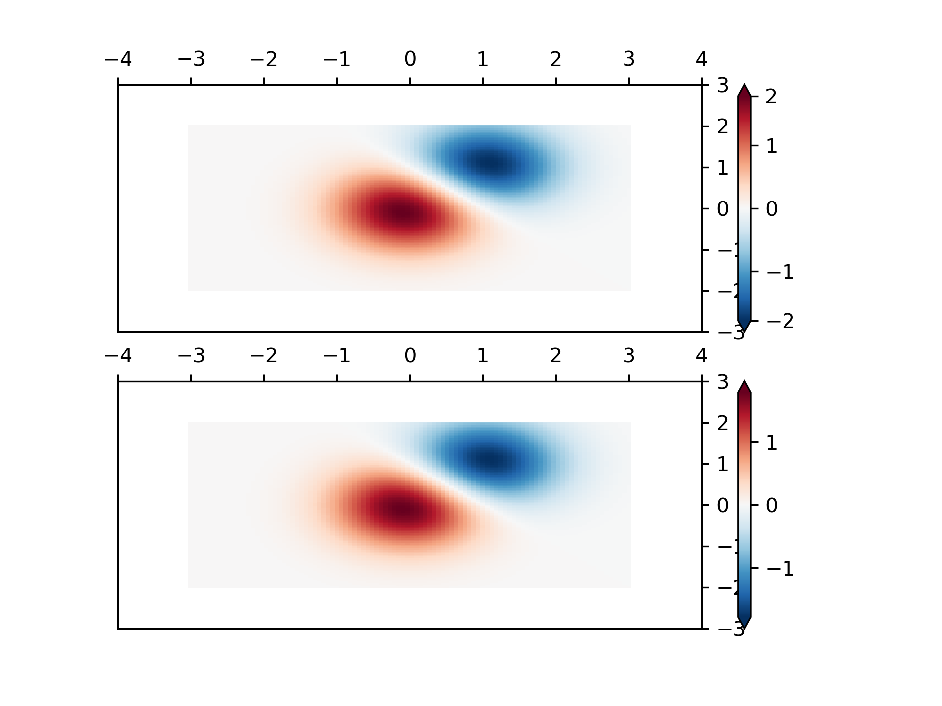
... # Custom Norm: An example with a customized normalization. This one
... # uses the example above, and normalizes the negative data differently
... # from the positive.
...
... X, Y = np.mgrid[-3:3:complex(0, N), -2:2:complex(0, N)]
... Z1 = np.exp(-X**2 - Y**2)
... Z2 = np.exp(-(X - 1)**2 - (Y - 1)**2)
... Z = (Z1 - Z2) * 2
...
... # Example of making your own norm. Also see matplotlib.colors.
... # From Joe Kington: This one gives two different linear ramps:
...
...
... class MidpointNormalize(colors.Normalize):
... def __init__(self, vmin=None, vmax=None, midpoint=None, clip=False):
... self.midpoint = midpoint
... super().__init__(vmin, vmax, clip)
...
... def __call__(self, value, clip=None):
... # I'm ignoring masked values and all kinds of edge cases to make a
... # simple example...
... x, y = [self.vmin, self.midpoint, self.vmax], [0, 0.5, 1]
... return np.ma.masked_array(np.interp(value, x, y))
...
...
... #####
... fig, ax = plt.subplots(2, 1)
...
... pcm = ax[0].pcolormesh(X, Y, Z,
... norm=MidpointNormalize(midpoint=0.),
... cmap='RdBu_r', shading='nearest')
... fig.colorbar(pcm, ax=ax[0], extend='both')
...
... pcm = ax[1].pcolormesh(X, Y, Z, cmap='RdBu_r', vmin=-np.max(Z),
... shading='nearest')
... fig.colorbar(pcm, ax=ax[1], extend='both')
...
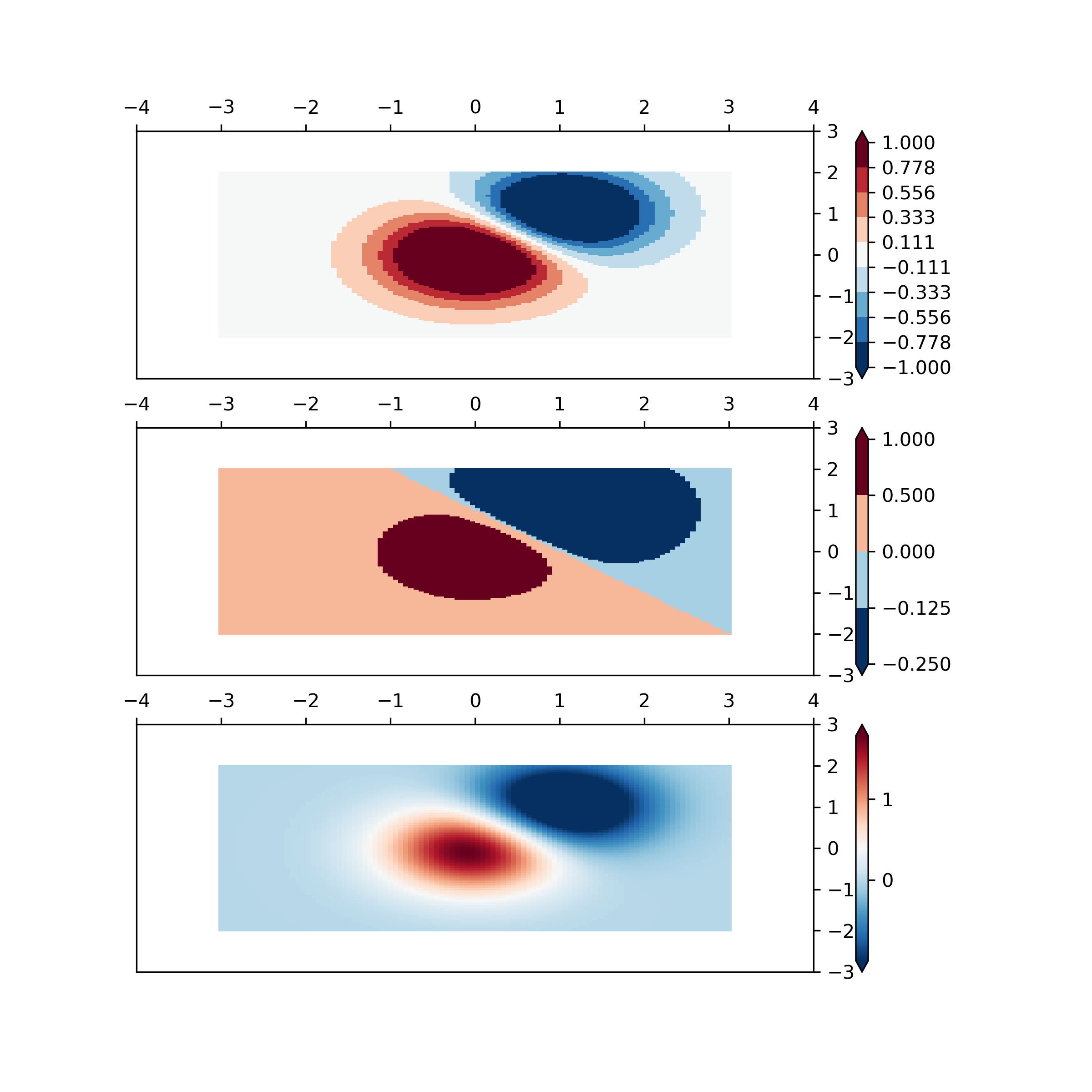
... ###############################################################################
... # BoundaryNorm: For this one you provide the boundaries for your colors,
... # and the Norm puts the first color in between the first pair, the
... # second color between the second pair, etc.
...
... fig, ax = plt.subplots(3, 1, figsize=(8, 8))
... ax = ax.flatten()
... # even bounds gives a contour-like effect
... bounds = np.linspace(-1, 1, 10)
... norm = colors.BoundaryNorm(boundaries=bounds, ncolors=256)
... pcm = ax[0].pcolormesh(X, Y, Z,
... norm=norm,
... cmap='RdBu_r', shading='nearest')
... fig.colorbar(pcm, ax=ax[0], extend='both', orientation='vertical')
...
... # uneven bounds changes the colormapping:
... bounds = np.array([-0.25, -0.125, 0, 0.5, 1])
... norm = colors.BoundaryNorm(boundaries=bounds, ncolors=256)
... pcm = ax[1].pcolormesh(X, Y, Z, norm=norm, cmap='RdBu_r', shading='nearest')
... fig.colorbar(pcm, ax=ax[1], extend='both', orientation='vertical')
...
... pcm = ax[2].pcolormesh(X, Y, Z, cmap='RdBu_r', vmin=-np.max(Z1),
... shading='nearest')
... fig.colorbar(pcm, ax=ax[2], extend='both', orientation='vertical')
...
... plt.show()
...