>>> """
===================================
Percentiles as horizontal bar chart
===================================
Bar charts are useful for visualizing counts, or summary statistics
with error bars. Also see the :doc:`/gallery/lines_bars_and_markers/barchart`
or the :doc:`/gallery/lines_bars_and_markers/barh` example for simpler versions
of those features.
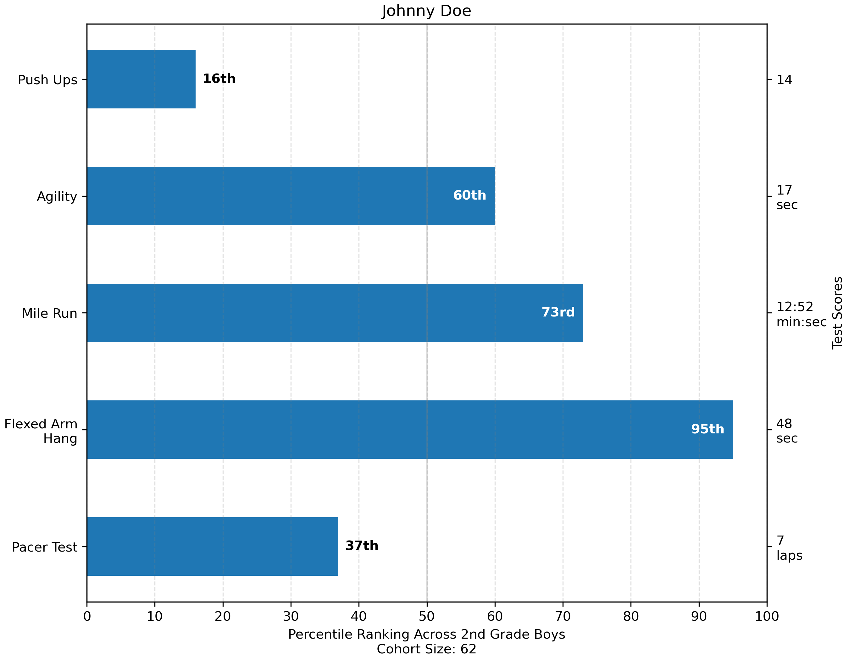
This example comes from an application in which grade school gym
teachers wanted to be able to show parents how their child did across
a handful of fitness tests, and importantly, relative to how other
children did. To extract the plotting code for demo purposes, we'll
just make up some data for little Johnny Doe.
"""
...
... from collections import namedtuple
... import numpy as np
... import matplotlib.pyplot as plt
...
...
... Student = namedtuple('Student', ['name', 'grade', 'gender'])
... Score = namedtuple('Score', ['value', 'unit', 'percentile'])
...
...
... def to_ordinal(num):
... """Convert an integer to an ordinal string, e.g. 2 -> '2nd'."""
... suffixes = {str(i): v
... for i, v in enumerate(['th', 'st', 'nd', 'rd', 'th',
... 'th', 'th', 'th', 'th', 'th'])}
... v = str(num)
... # special case early teens
... if v in {'11', '12', '13'}:
... return v + 'th'
... return v + suffixes[v[-1]]
...
...
... def format_score(score):
... """
Create score labels for the right y-axis as the test name followed by the
measurement unit (if any), split over two lines.
"""
... return f'{score.value}\n{score.unit}' if score.unit else str(score.value)
...
...
... def plot_student_results(student, scores_by_test, cohort_size):
... fig, ax1 = plt.subplots(figsize=(9, 7), constrained_layout=True)
... fig.canvas.manager.set_window_title('Eldorado K-8 Fitness Chart')
...
... ax1.set_title(student.name)
... ax1.set_xlabel(
... 'Percentile Ranking Across {grade} Grade {gender}s\n'
... 'Cohort Size: {cohort_size}'.format(
... grade=to_ordinal(student.grade),
... gender=student.gender.title(),
... cohort_size=cohort_size))
...
... test_names = list(scores_by_test.keys())
... percentiles = [score.percentile for score in scores_by_test.values()]
...
... rects = ax1.barh(test_names, percentiles, align='center', height=0.5)
... # Partition the percentile values to be able to draw large numbers in
... # white within the bar, and small numbers in black outside the bar.
... large_percentiles = [to_ordinal(p) if p > 40 else '' for p in percentiles]
... small_percentiles = [to_ordinal(p) if p <= 40 else '' for p in percentiles]
... ax1.bar_label(rects, small_percentiles,
... padding=5, color='black', fontweight='bold')
... ax1.bar_label(rects, large_percentiles,
... padding=-32, color='white', fontweight='bold')
...
... ax1.set_xlim([0, 100])
... ax1.set_xticks([0, 10, 20, 30, 40, 50, 60, 70, 80, 90, 100])
... ax1.xaxis.grid(True, linestyle='--', which='major',
... color='grey', alpha=.25)
... ax1.axvline(50, color='grey', alpha=0.25) # median position
...
... # Set the right-hand Y-axis ticks and labels
... ax2 = ax1.twinx()
... # Set equal limits on both yaxis so that the ticks line up
... ax2.set_ylim(ax1.get_ylim())
... # Set the tick locations and labels
... ax2.set_yticks(
... np.arange(len(scores_by_test)),
... labels=[format_score(score) for score in scores_by_test.values()])
...
... ax2.set_ylabel('Test Scores')
...
...
... student = Student(name='Johnny Doe', grade=2, gender='Boy')
... scores_by_test = {
... 'Pacer Test': Score(7, 'laps', percentile=37),
... 'Flexed Arm\n Hang': Score(48, 'sec', percentile=95),
... 'Mile Run': Score('12:52', 'min:sec', percentile=73),
... 'Agility': Score(17, 'sec', percentile=60),
... 'Push Ups': Score(14, '', percentile=16),
... }
...
... plot_student_results(student, scores_by_test, cohort_size=62)
... plt.show()
...
... #############################################################################
... #
... # .. admonition:: References
... #
... # The use of the following functions, methods, classes and modules is shown
... # in this example:
... #
... # - `matplotlib.axes.Axes.bar` / `matplotlib.pyplot.bar`
... # - `matplotlib.axes.Axes.bar_label` / `matplotlib.pyplot.bar_label`
... # - `matplotlib.axes.Axes.twinx` / `matplotlib.pyplot.twinx`
...